Configurator UX Patterns That Reduce Abandonment for Custom Jewelry
Rebuild the in-store jewelry advisor's five core jobs into configurators that actually convert.

Custom jewelry has the worst cart abandonment rate in e-commerce, north of 81% according to Baymard Institute's 2026 rollup of 50 studies. This is a category where the buyer is nervous, the ticket price is real money, and nobody's standing next to them explaining why the halo setting costs $400 more than the plain band.
Fine jewelry converts online at something like 1 to 2%, but put an actual person on the floor and that number jumps to 30 to 50%. That gap has a name, and it's the advisor. Pull the person who knows the product, reads the customer, and nudges them past hesitation, and the numbers above are exactly what's left.
Baymard also found 43% of shoppers abandon carts because they weren't ready to buy yet, a group that's largely just window shopping. The interesting group is the other 57%, the ones with real intent who left anyway. In custom jewelry this gets worse, because these shoppers already spent ten minutes picking a stone shape and a metal type. They did the work, and they still walked, which means effort alone doesn't stop abandonment. Sometimes the configurator itself is the thing pushing people out the door.
What the in-store advisor actually does that a static configurator doesn't
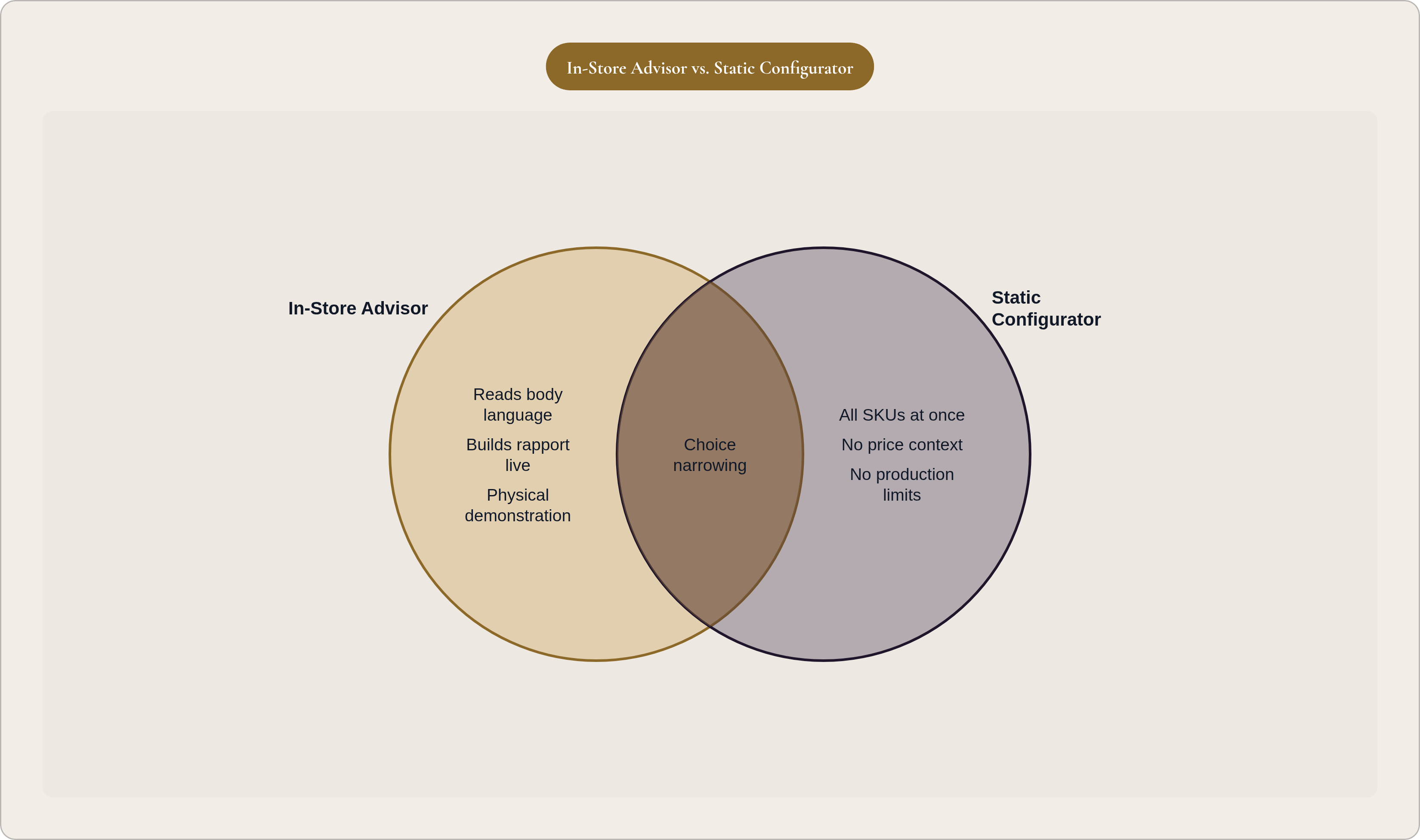
Watch a good jewelry advisor for five minutes, and you'll see them running about five jobs at once, none of which show up on a typical product page.
They narrow the field instead of dumping every SKU in front of you. They validate choices in real time, something like "yeah, that prong style holds an oval stone just fine," which quietly kills the fear of picking wrong. Trust builds a little with every exchange, not from one badge slapped near the buy button. When a customer stalls, they create motion instead of letting the silence sit there. And they explain price, not just the number but the why behind it, so sticker shock never gets a real shot at the sale.
Jewelry shoppers look at 8 to 12 product images before buying, more than almost any other category. That's someone trying to manufacture, alone, the reassurance a person would normally just hand them.
The buyer doing all that looking is increasingly flying solo, too. A BriteCo survey from October 2025, polling 2,000 Americans, found 80% of adults are now more likely to buy fine jewelry for themselves, and 86% among millennials. Nobody's gifting them a budget, and no sales associate is standing three feet away. So the brief is obvious, if not easy: rebuild those five advisor jobs into something that runs without a human in the room.
Instant visual feedback as the advisor's hand on the glass case
In a store, the advisor puts the ring on velvet, tilts it under the light, spins it so you catch every angle. Digitally, real-time 3D rendering is the only thing that gets close.
Swap rose gold for platinum and you expect to see it happen right then, not in three seconds, and not after a page reload. A laggy or static preview forces the customer to imagine the result, and that's the exact gap where doubt slips in. Conversion research puts the lift from 360-degree product views as high as 30%. In a category where visual trust is the whole ballgame, render quality is arguably the single highest-leverage line item on the page.
Zoom in and the small stuff starts doing real work: prong placement, engraving depth, how a finish catches light under different bulbs. A configurator that only renders the wide shot misses the exact questions that make people stall out and close the tab.
Seeing clearly and deciding correctly, though, are two different problems.
Guided step-by-step flows that narrow choice instead of presenting it all at once
No advisor worth their commission opens the whole case and gestures at everything at once. They ask two questions, then hand over three options. A configurator that dumps every variable on one screen just recreates the glass counter, minus the human who could've helped you through it.
What actually works is a linear sequence: setting, then stone, then review, each step revealing the next only once the last one locks. That does a few things at once. It makes the process feel like progress instead of an expanding to-do list, and it keeps attention on one decision at a time, which cuts the mental load considerably. It also builds small commitments along the way, each one a little harder to abandon than a blank form would've been.
GemFind's three-step model (Setting, then Diamond, then Review) is a documented version of exactly this. Flows built this way keep people on the page longer and cut bounce, mostly because the customer always knows what's coming next instead of staring down forty toggles at once.
Sequence matters more than step count, and the goal is to feel guided, not interrogated by a form. Worth a footnote, though: some shoppers show up already knowing exactly what they want, and marching them through three steps just annoys them. A quiet "skip to summary" option, tucked in without disrupting the default path, respects that without tearing up the structure for everyone else.
Pricing transparency as the advisor's ability to explain "why it costs that"
In a store, a price objection gets an answer. The advisor tells you what the casting involves, why the material costs what it costs, why this option is worth the extra $200. Online, a number just appears with zero context, and that's precisely where abandonment data lights up.
Real-time pricing, updating as the customer swaps metal, stone, or size, solves two problems at once. It kills the fear of hidden costs showing up later, and it hands the customer some sense of control over their own spending. A "request a quote" flow, by contrast, introduces a waiting period, and waiting periods are where customers go research competitors and quietly never come back.
This only works if the pricing engine actually understands production. Say it doesn't know 18k gold costs more to cast than silver, or that a 2-carat stone forces a different mount. The quote it spits out is wrong, and a wrong quote breaks trust faster than no quote at all ever could.
Pair transparent pricing with buy-now-pay-later options like Afterpay or Klarna, and you solve a related but separate problem: the customer who trusts the number but can't swallow it whole. The $180 average order value benchmark for jewelry e-commerce (Wisepim, 2026) badly undersells custom work, where a single fine piece often runs several multiples of that. Financing removes the last friction standing between "I love this" and "I bought this." One more number worth sitting with: jewelry brands using on-site personalization to surface relevant promotions saw conversion climb to 13.3%, up from a baseline under 4%, with average order value up 10.8% on top of that. Price clarity plus a relevant offer beats either one working alone.
Trust signals placed where hesitation actually peaks, not where they're convenient to place
A good advisor builds trust across the whole conversation, not through a credential flashed at the door. Most configurators dump their trust signals in the footer or the checkout summary, right where the customer has usually already decided to leave.
Hesitation spikes at three specific moments: when the price first appears, when payment details get requested for something they haven't physically touched, and when they're not sure a custom piece can even be returned if it's wrong.
Place things accordingly, then. Certification and return policy language belongs right next to the price, not three scrolls away. Financing options should surface the moment price reveals itself, not get buried at checkout. Verified reviews belong on the configuration page itself, not just the static product listing somewhere else on the site.
Cart abandonment recovery emails matter here too, averaging something like a 40% open rate, well above the roughly 21% typical for standard marketing email. That's a second shot at planting a trust signal for someone who already hesitated once. And custom jewelry has an argument generic categories don't get: because the buyer built the piece themselves, hearing from someone who built something similar carries more weight than a pile of aggregate star ratings on a plain SKU.
Production guardrails that make the configurator a reliable promise, not a creative sandbox
An in-store advisor would never let someone walk out having "designed" a 0.1mm band holding a 5-carat stone. They know what the workshop can physically build. A configurator with no limits will let that same customer configure exactly that, take their money, and hand the mess to manufacturing to sort out.
Production guardrails keep the options honest: metals the manufacturer actually stocks, stone sizes that fit the mount geometry, dimensions that won't snap under normal wear. This is the configurator keeping a promise it already made, without boxing in creativity to do it. A buyer who can only configure things that will actually ship correctly trusts the process more than one who can configure anything and then waits two weeks for an apologetic "we need to adjust your order" email.
According to Pencil Design's own configurator documentation, custom pieces built through properly constrained configurators target return rates below 3% and production rejects under 2%, because the customer designed exactly what ended up on the bench. The endpoint matters as much as the constraint, too: a configurator that outputs a production-ready CAD file, rather than a pretty render or a rough concept, closes the loop between what the customer saw on screen and what actually gets cast. Any daylight between those two things is a trust gap waiting to open up.
This is the advisor test in its sharpest form, really, since their credibility rests entirely on knowing what can actually be made. A configurator earns that same credibility only when its option set is bounded by manufacturing reality, not by whatever looked cool in the design team's Figma file.
Mobile UX as the context most custom jewelry shoppers are actually in
Over 70% of jewelry e-commerce traffic comes from mobile, which makes it the default experience now, whether the design team planned for it or not.
Mobile abandonment sits at 75.50%, a full 6.46 points above tablet, mostly because checkout flows and form complexity get worse on a small screen, not better. A multi-step configurator built without mobile in mind just recreates every friction point, at a rougher scale.
The failure modes show up in predictable spots: 360-degree viewers built for mouse-drag that ignore touch gestures entirely, option grids designed around hover states that become nearly impossible to tap with a thumb, pricing totals that get cut off or need extra scrolling to find, checkout forms that pull up the wrong keyboard on a phone.
Mobile-first design means building the interaction model for thumbs first, then expanding up to desktop, rather than shrinking a desktop layout down to fit a smaller frame. Think of it as an advisor who only greets customers coming through one specific door, technically available to everyone but practically useless to most of them.
How parametric and AI-powered configurators replicate the advisor at scale
Guided flows, live pricing, production limits: all of it depends on the configurator actually "knowing" things, like which combinations are valid, what a bigger stone does to price, and what's even available given what this customer just said they wanted.
Template-driven configurators fake that knowledge with a fixed menu. Someone pre-built every valid combination, the customer picks from what's there, and anything outside that matrix simply doesn't exist. That's a poor match for how an advisor actually works, and a worse match for how customization is supposed to feel.
Parametric design flips the model. Instead of fixed geometry, you get rules and relationships. Change the finger size, the stone diameter, the band width, and every dependent piece of geometry adjusts on its own. That's the gap between a genuinely dynamic configurator and a dropdown menu wearing a costume.
AI pushes it one step further. Instead of clicking through a menu, the customer just says what they want: something delicate, everyday wear, white gold, keep it under $1,800. The AI narrows the field and hands back options, which is about as close as software gets to an advisor's opening two questions.
Pencil Design builds on exactly this combination, parametric templates plus AI-generated design plus production-ready CAD output, so the same logic guiding the customer's choices also produces the file that goes straight to manufacturing. The advisor comparison holds all the way to the workshop floor, not just up to the checkout page. With over 100,000 designers on the platform and more than 5 million customization options in play, the evidence points somewhere specific: advisor-level depth doesn't require a human in every session. It requires a rule system smart enough to act like one.
What a well-architected custom jewelry configurator looks like end to end
These patterns don't work as a checklist you knock out in random order. They form a sequence, and the sequence maps onto something close to an actual conversation on the sales floor.
Real-time visuals do the showing, step-by-step flow does the narrowing, and live pricing does the explaining, both the number and the reason behind it. Trust signals, placed where hesitation actually spikes, do the reassuring, while production guardrails keep the promise honest. Mobile-first design just meets people where their thumbs already are. And underneath all of it, parametric or AI logic proves the one thing every good advisor eventually proves: it adapts to you, not the other way around.
Get that sequence right and 81% stops being a law of physics for the category. It becomes a symptom, plain and simple, of the advisor going missing. Turns out the advisor was never strictly a person to begin with. It was a set of jobs, and software can do a version of most of them, provided somebody actually bothers to build it that way.