Product Page Optimization for Made-to-Order Jewelry
Visualize custom pieces before they exist to close the gap between imagination and commitment.

Made-to-order jewelry pages have to sell something that doesn't exist yet. A standard product page shows a customer an object they can mentally hold; a made-to-order page has to build that same feeling of ownership around a ring that hasn't been cast, using nothing but pixels and a promise.
What customers are actually trying to resolve before committing to a custom order
Three worries sit under every custom jewelry decision, whether the customer ever says them out loud. Will it actually look like what I'm picturing? That's the visualization gap, and it's the loudest one in the room.
Cost sits right behind it. High costs impact nearly half of potential custom jewelry customers, and a page that slaps a number on screen without explaining where it came from is leaving money on the table for no good reason. Then there's the quieter one: what happens if I hate it, or it breaks two weeks after I've paid?
Cost isn't the whole story, though. Most people buying custom pieces say they want something that reflects them specifically, individuality over convenience. So the emotional case carries at least as much weight as the price justification. Bury "why go custom" in an FAQ nobody clicks, and you've missed where the actual motivation lives.
The category keeps growing too, which sounds like good news until you realize growth just means more people showing up to a door that may or may not open. Self-purchasing plays into this. Most adults now say they'd rather buy fine jewelry for themselves than wait around to be gifted it, and self-purchasers don't impulse-buy anything at engagement-ring price points. They research, compare, leave the tab open, wander off, and come back three days later, which means the page has to hold up across several visits, not one big first impression.
Before a customer clicks anything that costs money, the page owes four answers: can I see what I'm getting, how long will this take, how do my choices move the price, and can I trust whoever's making this. Nothing fancy, just the stuff a customer is owed before they hand over a deposit.
How the configurator functions as the core selling mechanism, not a feature add-on
Think of the configurator as the page's engine, the thing that actually lets someone build ownership over an object before it physically exists. A photo can't do that, and a paragraph of copy definitely can't either.
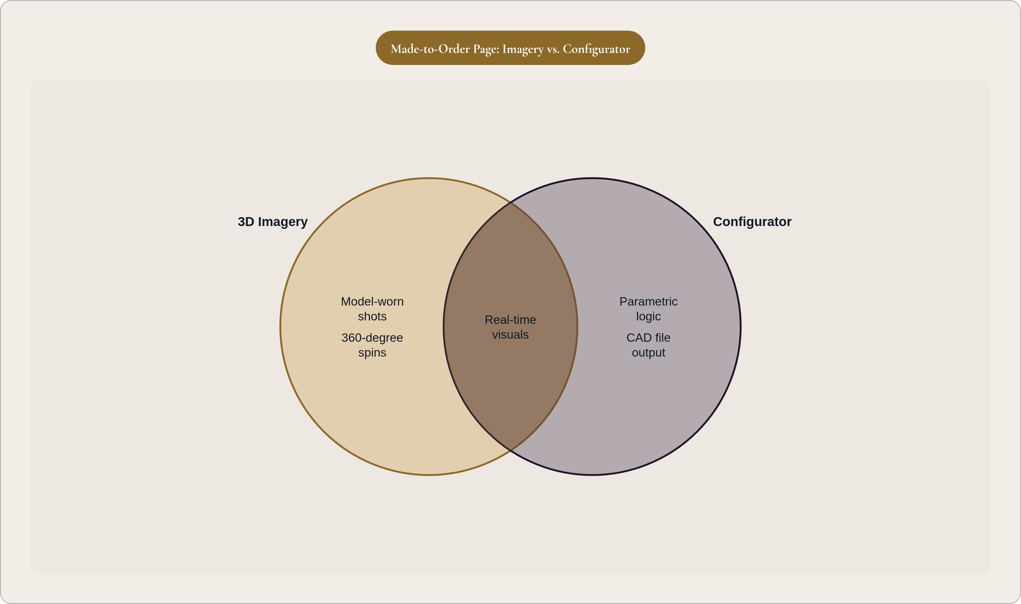
A configurator worth the name handles metal type and finish, stone selection (shape, size, setting style), sizing, engraving, and updates price in real time as the customer clicks around. Real-time pricing matters more than it sounds like it should. It's the fastest way to close the cost-transparency gap, letting someone watch choices turn into dollars instead of guessing and getting ambushed at checkout.
Underneath all that sits parametric logic, and it's the reason a configurator doesn't collapse under its own complexity. Bump the ring size up half a step, swap a half-carat stone for a full carat, and the rest of the design needs to shift automatically. Nobody wants a design team rebuilding a file by hand every time someone clicks a different option. Pencil's platform runs on this kind of behavior specifically so a piece stays balanced and stays something a jeweler can actually cast, rather than something that just looks nice frozen on a screen.
A configurator that spits out a pretty picture but no manufacturable file creates rework for the brand and a mismatch for the customer, who ordered one thing and got a rough cousin of it. Every configuration built on Pencil's platform outputs a production-grade CAD file ready for casting, so the render on screen and the file heading to the factory are the same object, not two different ideas wearing the same photo.
Watch for these habits, because they're everywhere: options buried in dropdowns that don't visually update, prices hidden until checkout, saved configurations that vanish the moment the tab closes, mobile layouts that fall apart under a thumb. That last one isn't a footnote. The majority of online jewelry transactions happen on a phone now, so a configurator that only behaves on desktop is quietly turning away most of its own traffic without anyone on the team noticing.
Imagery and visualization when no physical sample exists
A made-to-order brand can't photograph every metal-and-stone combination it sells. There's no physical version of most of them sitting in a drawer somewhere, waiting for a photographer. Shooting each variant would eat a warehouse of samples and a budget nobody has signed off on.
Photorealistic 3D rendering solves this from the design file outward. High-fidelity images get generated straight from the CAD geometry before any metal touches a flame, and every configuration a customer builds shows up rendered in their exact chosen metal and stone. Model-worn shots, ring on a hand, pendant against a collarbone, get produced digitally too, with zero physical samples involved.
AI-assisted rendering has pushed this further. Designers now generate photorealistic and model-worn imagery straight from the design stage, cutting reliance on physical prototypes down to almost nothing, which matters a lot for brands still working from concept sketches instead of finished pieces sitting in a case.
At minimum, a made-to-order page needs a few things: multiple angles (front, side, top, worn), something for scale, like a ring actually on a finger instead of floating in a void, close-up shots of the setting or hallmark that justify the price tag, and imagery that updates live as the configuration changes. Video and 360-degree spins add another layer of trust, especially anywhere light and texture are doing the emotional heavy lifting.
None of this works in isolation, though. Imagery proves beauty, not buildability, and that second kind of proof lives in the configurator's manufacturing logic underneath. That's exactly why imagery and configurator need to run as one system, not two departments pretending not to notice each other exists.
Copy and transparency elements that make an unbuilt product feel real and safe to buy
Copy on a made-to-order page has a different job than copy on a regular product page. It's narrating a process more than describing an object, and it has to set expectations a customer can hold onto during the wait that follows.
The timeline needs to live right on the product page, stated plainly ("made in 10 to 14 business days"), not buried three clicks deep in an FAQ nobody opens. A short walkthrough of what happens after the order goes in builds confidence that a real operation is running behind the screen and not just a form submission into a void. Materials and craftsmanship deserve an actual description, one that earns the price instead of just stating it, and the cancellation or modification policy needs to sit in plain view, doing double duty as risk reassurance.
Pricing copy should frame the number as a direct result of the customer's own choices, not a figure that materialized out of nowhere. If the configurator updates price live, the copy around it should say so, reinforcing that connection instead of treating price like a separate conversation happening somewhere off to the side.
Social proof works a little differently here too. Reviews that talk about the ordering experience ("I was nervous buying something I couldn't see first, but…") do more work than reviews that just praise the finished piece. Photos from past customers close the "will it look right" gap better than any render could, since renders are aspirational and customer photos are just evidence. A stated number, pieces made, customers served, adds a track record without needing a quote to prop it up.
Trust signals for the "what if this goes wrong" fear should be stated plainly: return or remake policy, a quality guarantee tied to real manufacturing standards, clear terms on deposits and payment security. This copy should read like a friend who actually knows the process standing next to the customer, because someone spending real money on something they can't touch yet reads every sentence more carefully than someone tossing socks into a cart.
How page architecture and user flow affect completion rates on configuration-driven pages
The classic e-commerce layout, hero shot, description, reviews, buy button, was built for products already sitting in a warehouse. Apply that to a configuration-heavy page and you've got the wrong shape from the start.
A better flow leads with the configurator itself, or a strong render sitting next to an obvious "start customizing" button, instead of a wall of copy someone has to wade through first. Progressive disclosure helps here: show the common choices (metal, stone) up front, and reveal the finer stuff (engraving, setting style) as the customer gets deeper in. A summary panel, locked in place as the page scrolls, keeps the current configuration, price, and estimated timeline visible the whole way through, so nobody loses track of what they've built or what it's going to cost them.
Process reassurance, the timeline, the quality guarantee, belongs right below the configurator, not buried at the bottom where nobody scrolls that far anyway. Reviews and customer photos work better positioned after the configurator than before, since someone who just finished designing their own piece wants validation of that specific decision, not generic praise for the product line in general.
Mobile needs attention from the start, not as a patch tacked on later. The majority of online jewelry transactions happen there now, so a configurator that's clumsy on a small screen bleeds customers no matter how polished the desktop version looks in a deck.
Save-and-return functionality earns real weight here, because custom purchases stretch across sessions by nature. Lose the exact configuration a customer left behind, and the trust-building process resets to zero every time they come back, until eventually they just stop coming back at all.
Button language deserves a second look, too. "Add to Cart" implies something sitting on a shelf, waiting to be grabbed. "Start My Order" or "Confirm This Design" acknowledges the customer just built the thing themselves, which happens to be true, and reads a lot more honestly to someone who spent twenty minutes customizing a ring.
What separates configurators that close sales from those that create confusion
Too many choices with too little guidance kills configurators quietly. Overwhelmed customers don't complain out loud, they close the tab and go make a sandwich, and that's a worse outcome for a brand than any objection a salesperson could've talked them through in five minutes.
Curated optionality fixes this. The configurators that convert best don't dump every variable on someone at once. They walk people through a sequence: metal first, then stone, then setting, then the finer stuff, with visual feedback confirming each choice before the next one loads. It ends up feeling less like filling out a form and more like actually building something with your hands.
Manufacturing integrity is the other half, less visible but every bit as important. A configurator is only as good as what it hands off on the back end. If the configuration can't translate directly into a production file, the brand has sold a promise it can't quite keep, and that's where parametric design and production-grade CAD output stop being a technical footnote and start being the actual line between platforms that work and platforms that don't. Pencil is built around every configuration producing a castable CAD file, which closes the gap between what the customer designed on a laptop and what the factory actually receives.
AI-assisted recommendation logic adds a layer on top, surfacing something like "customers who chose this stone typically pair it with this setting." Small nudge, but it cuts decision fatigue, and it tends to push average order value up a little too, since customers who feel guided get more comfortable adding on than they walked in planning to.
Real-time pricing does trust work here, not just convenience work. Swap a lab-grown stone for a natural sapphire and watch the price jump instantly, with a short line explaining why, and that jump feels earned instead of arbitrary. Good configurator logic should also stop people from picking combinations that are physically impossible or structurally weak, protection built into the interface itself rather than caught after the fact by a confused production team.
The demand behind all this isn't small, either. Custom and personalized goods now make up a real chunk of total marketplace transactions on platforms like Etsy. The appetite is already there, already spending money. Whether a given page's infrastructure is actually built to catch that demand is a separate, much less settled question.
Measuring whether a made-to-order page is performing and what to adjust first
Standard product-page metrics don't tell the full story here. Raw pageviews are close to meaningless on a configuration-driven page, while completion rate through the configurator is the number that actually says something worth acting on.
Track a handful of things: configuration start rate (what percentage of visitors even touch the configurator), configuration completion rate (what percentage of starters finish a full, orderable design), the specific drop-off step (almost always the highest-complexity or highest-cost decision in the flow), return session rate (how often people come back to a saved configuration before finally ordering), and conversion broken out by traffic source, since someone arriving from a search for "custom sapphire ring" behaves nothing like someone who clicked a brand awareness ad on a whim.
Where the drop-off happens tells you what to fix. A low start rate points back to the entry point itself: the hero image, the headline, the first call to action isn't communicating that customization is even on the table, let alone that it's easy. A low completion rate usually means one specific step in the configurator is scaring people off, and that's the moment to test progressive disclosure, add a line of guidance copy, or just cut the number of decisions crammed into that step. Low conversion after someone's already finished their configuration points to trust signals, pricing clarity, or process transparency falling short, and the fix is usually adding real customer photos, sharpening the stated timeline, or turning up the volume on the remake policy.
One thing worth saying plainly for anyone running A/B tests on these pages: made-to-order decisions stretch across multiple sessions, so a short testing window hands back misleading results almost every time. Give the test room to breathe the way the customer's own decision-making does, over days, not hours.
Every metric on this list is really asking one question from a different angle: did the page close the distance between something that doesn't exist yet and a customer willing to pay for it anyway? The configurator, the renders, the copy, the layout, each does its own piece of the job. Together, they're just machinery built for one purpose: getting a nervous person to say yes to something they can't yet hold in their hands.