Checkout Flow Design for Made-to-Order Jewelry Brands
Real-time pricing and clear spec breakdowns convince customers to commit money to unmade pieces.

Made-to-order jewelry checkout is a structured handoff, one that has to move a customer from creative choice to manufacturing commitment without ever letting them hold, touch, or return the thing they're paying for. It's a different task from a standard e-commerce funnel with extra steps bolted on.
Normal checkout is simple: product exists, customer decides, payment confirms the exchange. Custom jewelry breaks that model at the root. At the exact moment a customer hits "pay," the ring or pendant they're buying is still a configuration, not a hallmarked object sitting in a drawer somewhere. It's a promise. And promises are a much harder sell than shelf items, which is a big part of why fine jewelry sits in the lowest-converting corner of e-commerce, with benchmark data from 2025 putting typical conversion between 0.5% and 1.0%. Add the made-to-order layer on top, and you're asking someone to commit real money to something they can't try on, can't compare side-by-side, and can't send back without a conversation. The friction starts the second someone opens the configurator, well before anyone reaches a payment page.
How the configuration step functions as the first stage of checkout, not a separate product experience
Most teams treat the configurator like a product-page toy and checkout like the "real" funnel that starts later. For made-to-order jewelry, that split is a mistake. Every choice inside the configurator, metal, stone, setting, size, is a line item in the order that eventually gets built. Treat those choices as decorative and you get a customer who feels like they've been playing a game right up until the invoice arrives and reminds them it was never a game.
The flow should read as one continuous motion: configuration, summary, commitment, payment. Each stage should feel like the next sentence in the same paragraph, not a new chapter with a different narrator.
Good configurator architecture carries a lot of the checkout's weight before checkout even starts:
- A real-time visual that updates with every choice, so by the time someone reaches payment, they already have a clear picture in their head of what's coming
- Live pricing that updates as selections change, so nobody hits the summary page and finds a total that doesn't match what they expected
- Silent validation against incompatible combinations, catching problems before the customer ever sees them, rather than rejecting a choice after the fact
The ring builder model (setting, then stone, then metal and weight) works because it mirrors an actual in-store consultation. It teaches the customer as it goes, instead of dumping a form in front of them and hoping they know what a bezel setting is. And mobile parity isn't optional here. If the configurator falls apart on a phone screen, the checkout flow is broken before it begins; a clunky pinch-to-zoom experience is a fast way to lose someone who was otherwise sold.
This is also where manufacturability needs to live, quietly, in the background. Platforms like Pencil Design build validation directly into the configuration layer itself: prong sizing, seat depth, structural tolerances, checked as the customer builds, not after. The customer never even knows a bad combination got flagged and swapped out. What that buys the brand is simple but important: the configuration a customer finishes is a manufacturing input from the start, not a wishlist someone has to reinterpret later.
What the order summary page must accomplish for a custom piece that a standard summary page never has to
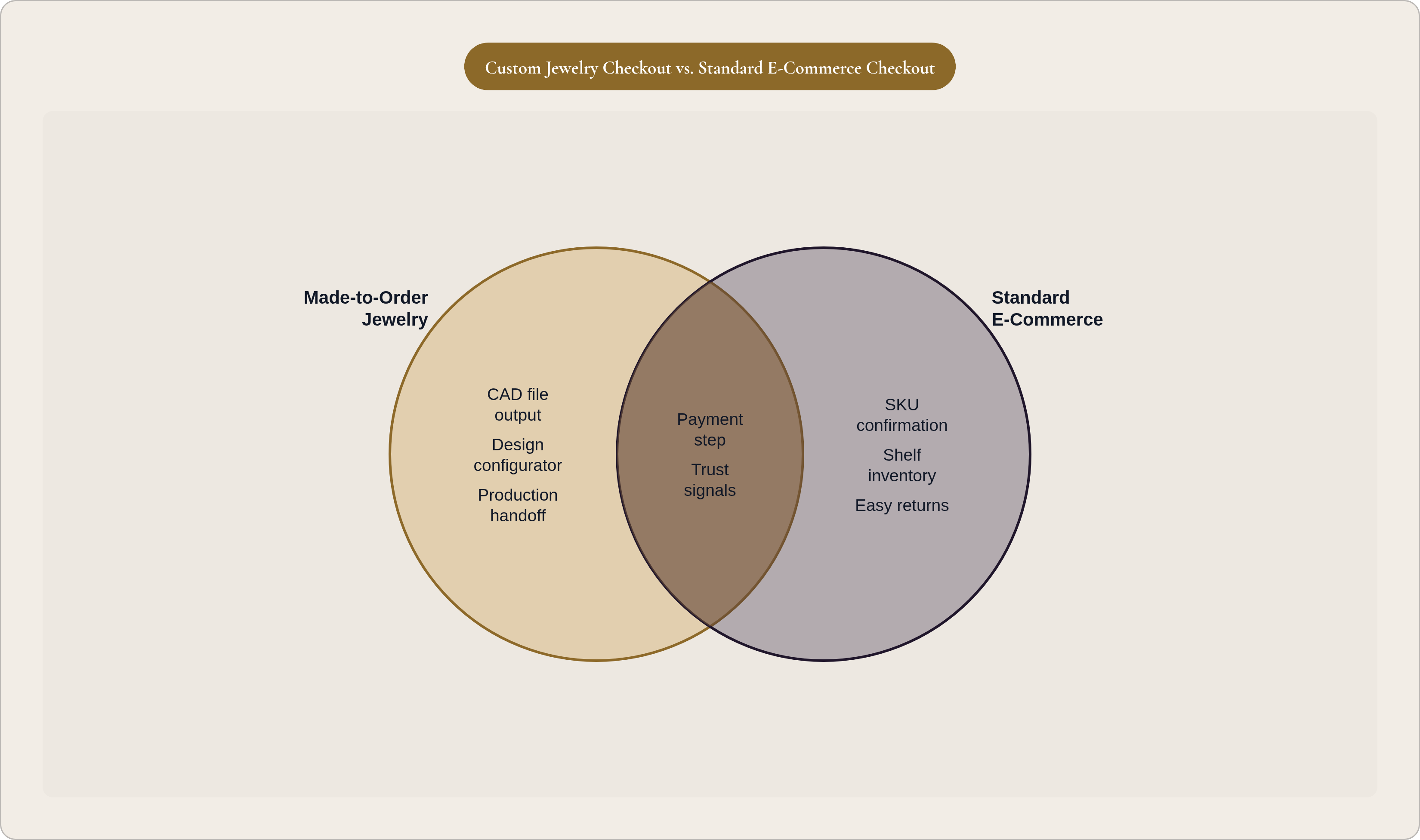
A normal order summary has one job: confirm SKU, quantity, price. Done. A made-to-order jewelry summary has a harder job, because there's no SKU to confirm. There's a design, and the page has to convince the customer that the design in front of them is exactly the design they built.
That means the summary page needs to show:
- A rendered image of the actual configured piece, not a stock photo of something similar
- A plain-language spec list (metal, stone, setting, ring size, engraving) written the way a person talks, not the way a catalog does
- A total price broken down enough that the customer understands what they're paying for (setting, stone, labor), not just a lump number
- A production window given as a real range, not "a few weeks"
- A next-steps section spelling out what happens after payment: when they'll hear from the brand, whether there's a review step, what the first real milestone looks like
Some brands add a design review checkpoint here, sending a CAD render or spec sheet for explicit sign-off before charging the card. It slows things down by a day or two. It also cuts down disputes and returns on high-ticket pieces, which is a fair trade most of the time.
What this page is really doing is psychological. The customer has already spent ten, fifteen, twenty minutes building this thing. They've made decisions, second-guessed a stone color, maybe closed the tab and come back. The summary page is the moment that investment either gets validated or wasted. Brands that revert to a generic product photo here, or bury the lead time three paragraphs down, or list metal purity specs instead of the design choices the customer actually cares about, are undercutting their own customer at the exact moment that customer needed reassurance the most.
How lead time, production transparency, and post-purchase communication reduce abandonment on high-consideration custom orders
The fear underneath every custom order is the same: I'm paying in full for something I won't see for weeks, and I have no idea if it's actually happening. Luxury and jewelry already run some of the highest abandonment rates in e-commerce. Made-to-order stretches the consideration window even longer and stacks production uncertainty on top of a purchase that was already expensive.
Lead time transparency has to happen before the payment screen, not in the fine print of a confirmation email nobody reads closely. If a brand offers rush production, the price difference should show up right there, inline, not require a support ticket to find out. And the language matters more than people think: "approximately two to three weeks" reads very differently from "up to six weeks," even when the actual production time is identical. Vague words like "approximately" and "up to" don't protect the brand from disappointing a customer; they just move the disappointment later, closer to a cancellation email.
Post-purchase communication is part of checkout, extending well past the moment checkout technically ends. A confirmation email that says "thanks, we'll be in touch" and then goes silent for three weeks is asking for a cancellation request. Milestone updates, order confirmed, in production, quality check, shipped, close that gap. Even something as small as one photo of the piece mid-production, generic or not, does a lot of work against buyer's remorse.
Brands that go quiet after payment are treating a made-to-order sale like it came off a shelf, and pretending otherwise is how a happy customer becomes a chargeback. Return policy language belongs in this same conversation: "custom orders are final sale," stated plainly before the customer pays, beats a policy they find out about after the piece arrives and doesn't fit.
Pricing presentation, payment options, and trust signals that close the gap between intent and payment on custom orders
Surprise costs at checkout are among the most common reasons people abandon carts. Jewelry doesn't get a pass on this; if anything, an unexpected duty or tax line hits harder when the base price was already four figures. International customers especially need to see landed cost up front. A number that grows once they hit "pay" on a custom piece reads as a bait and switch, even when it's just an honest tax calculation nobody flagged earlier.
Payment structure needs the same clarity. Plenty of made-to-order jewelry brands take a deposit at order and the balance at shipping, which mirrors how custom jewelry has worked in physical stores for decades. That structure lowers the psychological barrier to saying yes. But it only works if the checkout flow spells out exactly what's due now, what's due later, and what triggers the second charge. Full payment upfront can work too, as long as everything else in the flow, the renders, the spec sheet, the lead time, is doing enough trust-building to earn it.
Installment options (buy now, pay later) matter more at these price points than at, say, an inexpensive t-shirt. Splitting a high-ticket ring into four payments removes a wall that was keeping a real buyer on the fence, without cheapening the brand in the process.
Trust signals carry more weight here too, and not the generic kind:
- Authenticity documentation (certificates, hallmarking, stone grading reports) referenced right at checkout, not just mentioned somewhere on the About page
- Recognizable, secure payment methods, since ambiguity about security costs more when the transaction is worth more
- Testimonials that speak to the custom process specifically ("the piece matched exactly what I configured"), not just star ratings
- Information about the actual maker or studio behind the piece, which reminds the buyer a real person is receiving this order, not a warehouse
Fashion jewelry brands convert closer to general e-commerce rates, somewhere around 2.5% to 4.5%. Fine jewelry brands often land between 0.5% and 1.0%. The payment step is where that gap shows up most sharply, and it's also the step where design choices have the most leverage to close it.
Ring sizing, engraving fields, and other made-to-order inputs that, if handled poorly, stall or kill the sale
Ring sizing kills more custom jewelry sales than almost anything else on this list. People don't know their size, and they don't want to guess on something they can't send back without a hassle. That hesitation alone stalls a huge share of otherwise-committed buyers right at the finish line.
A few fixes actually move the needle:
- A sizing guide built into the page itself, so nobody has to leave and lose momentum
- An "I'll confirm my size later" option that still captures the order and locks in a size before production starts
- A resize guarantee stated directly at the size input field, not tucked away in a policy page three clicks deep
Engraving fields need similar care. Character limits should show up as the customer types, not as an error message after they've already written their message. A font preview, even a static one, cuts down on the "wait, will it actually look like that" anxiety. And a proofing step before final confirmation, showing exact spacing and layout, catches mistakes before they become a very expensive typo.
A few other inputs deserve the same attention: birthstone substitutions should confirm grade and sourcing right there in the configurator, not after the card is charged. Metal allergy prompts (nickel-free, hypoallergenic options) should surface automatically where relevant, rather than making the customer dig for them. Photo uploads for bespoke design briefs need file type and size limits stated up front, before someone spends five minutes fighting an upload button.
The pattern across all of these failures is the same. Teams treat these fields like paperwork to complete, when they're actually decisions the customer isn't fully confident making alone. A customer who pauses on an unconfident decision rarely comes back to finish it.
How the checkout flow connects to production — and why the handoff between customer order and manufacturing file determines whether the brand can deliver what was sold
Checkout ends at payment. The order doesn't. What happens next, the handoff into production, decides whether the brand can actually deliver the thing it just sold.
When checkout and production aren't connected, someone on the team has to manually translate a customer's configuration into instructions a casting house can use. That's where things go wrong: a spec sheet that doesn't quite match the render the customer approved, a ring size that never got confirmed, a stone pairing that needs a phone call to sort out. Every manual translation step is a place where margin leaks and errors creep in.
A checkout flow that's actually connected to production outputs three things automatically: a CAD file that reflects the customer's exact configuration, not a template that still needs redesigning; a manufacturing spec tied directly to that file, covering metal weight, stone count, setting dimensions, finish; and a record linking the customer's order to that specific file, so any dispute or change has a paper trail.
Parametric design is what makes this work at any real scale. Change the ring size, and the prong positions, band width, and seat depth adjust on their own, correctly, every time, instead of someone eyeballing it in CAD software after the fact. Building manufacturability checks into the configuration layer itself targets this loop, so structural problems are caught before the customer ever reaches the payment screen. The checkout, in that setup, functions as the first real step of production, not merely a sales interface.
Brands running on visualization-only tools or static configurators don't get that handoff for free. They sell the promise, then scramble afterward to rebuild the design in CAD before anyone can actually cast it. A checkout flow built the right way is the guarantee that what the customer approved is what gets made, and that guarantee is the difference between a scalable jewelry business and a bespoke shop wearing a website as a costume.