Jewelry Photography Standards for AI-Designed and Custom Products
Honest imagery standards keep AI-rendered jewelry from looking cheaper than it actually is.

I used to think jewelry photography was the easy part of this business, that you'd set up the light box, shoot the ring, and be done with it. Then AI-driven configurators showed up and broke the whole premise: now you're shooting a ring that doesn't exist yet, might never exist in that exact form, and needs to look convincing enough that someone hands over their credit card anyway. Jewelry already has one of the worst conversion rates in e-commerce (1.19% average, per Photta's case study data), so every image is either doing real work or quietly losing you a sale.
What changes about the product when it comes from a parametric or AI-driven workflow
Old-school jewelry photography had it easy, with one design, one model, and maybe a few sizes to shoot before moving on.
Parametric design ends that arrangement for good. One template can spit out thousands of valid configurations, band width and stone size and metal alloy and surface finish all sliding independently. Platforms built around this model tie each option back to a production-ready CAD file rather than a loose visual approximation. GLAMIRA says roughly half its citrine ring revenue now comes from digitally customized orders across more than 65 countries. Nobody's booking a studio for that, and you can't hire a photographer fast enough to keep up with a slider.
Three things shift every time someone drags that slider, and each one matters:
- Geometry changes with the parameter. A wider band isn't a cropped version of the narrow one; it's a different object entirely.
- Light behaves differently depending on the metal. Rose gold and white gold don't reflect the same way, even under identical bulbs.
- Surface finish decides where highlights land. Point a lighting rig built for polished platinum at a brushed finish, and it goes flat and gray, like it lost an argument with a dust cloth.
A second problem hides behind all this, and it's sneakier: AI concept art. A Fall 2024 study in Gems & Gemology, published by the GIA, caught tools like Midjourney and DALL-E generating jewelry with geometry that doesn't exist anywhere except the image. The proportions are convincing, sure, but nothing a caster could actually build. A configurator render traces back to validated CAD, while an AI concept image is a guess wearing a nice outfit.
Dimensional accuracy as a photography requirement, not just a design requirement
Point a camera at a real ring, and physics does the honest work for you. A render only tells the truth if the model and the camera settings behind it are honest too, and renders drift off-true more often than you'd think, usually without anyone noticing until a return shows up.
Three habits cause most of the damage. Render engines borrow lens distortion for looks, which quietly makes a band read thinner or a stone read bigger than it'll ever be on an actual hand. Nobody puts a scale reference in the frame, so the customer's left guessing whether this thing is dainty or a knuckle-duster. Camera distance also drifts between sizes, so a size 9 shot at the same frame fill as a size 6 ends up looking like it has the thinner band, backwards from reality.
The fixes aren't complicated. Lock the virtual camera's focal length somewhere in the 90 to 100mm range, macro lens territory, and don't let anyone pick a "nicer looking" focal length per image. Put a real scale reference in every shot, a standardized finger diameter or a millimeter callout, so nobody's eyeballing size off a screen. Hold frame fill constant across every size variant, too, so a bigger ring doesn't accidentally read smaller just because the camera backed up to compensate.
The CAD file already has the truth sitting in it. Photography's whole job is carrying that truth into the image without adding its own opinion.
Lighting standards for reflective metals and faceted stones across finish variants
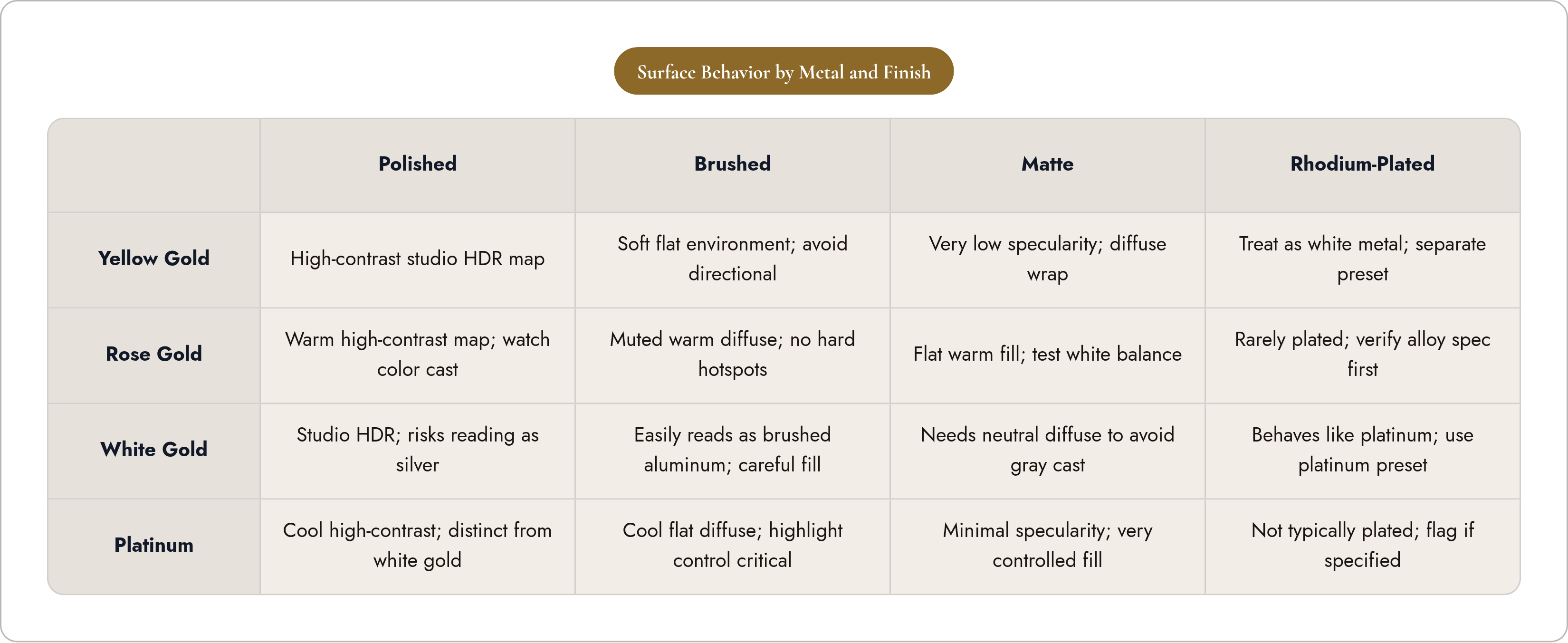
Jewelry is arguably the hardest thing to light in product photography, full stop. Metal is specular, and stones refract and transmit light instead of just bouncing it back at you, and the finish decides which of those two effects wins the argument. Even automated image-segmentation tools choke on reflective metal and faceted stones, so it's no surprise generic lighting rigs have the same blind spot.
Here's the arithmetic that makes this worse for custom jewelry: three metals times four finishes gets you twelve distinct surface behaviors, and each one needs its own lighting logic. Skip that, and a soft diffused setup built to flatter polished yellow gold turns brushed white gold into something that looks like brushed aluminum off a hardware store shelf. Overly directional light on a faceted stone gives you one lonely highlight, so the stone reads duller and smaller than it actually is. A white background doesn't even read the same against yellow gold as it does against rhodium-plated white gold, identical RGB values or not.
Treat lighting like a material spec, with numbers attached. Match HDR environment maps to the finish: high-contrast studio maps for polished metal, softer and flatter environments for brushed or matte. Give stones actual transmission lighting, light passed through the stone rather than just bounced off a table, or you get flat sparkle instead of real brilliance, and lock finish-specific render presets once and reuse them everywhere; don't let someone retune it because they liked how Tuesday's version looked.
If a brand's still shooting physical samples for bestsellers alongside renders, match the lighting geometry closely enough that nobody can tell which image came from a camera and which came from a GPU.
Representing finish and material variants without reshooting or re-rendering from scratch
Run the numbers on a modestly complex configurator: three metals, four finishes, five stone options, two band widths. That's 120 combinations, and even a couple minutes of render time per variant turns into a real bottleneck before retouching even enters the picture.
Manufacturing already solved its version of this. The 3D printed jewelry market hit $4.17 billion in 2025 and is projected to reach $4.89 billion in 2026, with material efficiency above 90%. Production scaled up fine, but imaging didn't keep pace, and you can tell.
The way out is structural:
- Render the geometry once per configuration, then apply material and finish as a separate layer, so swapping metals doesn't mean rebuilding the whole scene from scratch.
- Define each alloy and finish once, in a material library, with locked shader values. "18k rose gold, polished" should mean exactly one thing everywhere it appears.
- Fix a small set of camera angles (three-quarter front, top-down, profile, on-hand) and repeat them identically across the whole catalog, so customers build spatial intuition instead of relearning the layout every time they click something new.
Two rules apply here, with no exceptions. Never mix a photograph of one variant with a render of another in the same listing; the quality gap alone tips customers off that something's wrong. Also, never use color correction to paper over a wrong material setting: fix the material definition first, then let the pixels follow. A photography standard for custom jewelry ends up functioning as a pipeline standard, governing rendering and materials just as much as the final image.
On-hand and lifestyle imagery for configurations that may not yet physically exist
Mirrar's research puts it at 60% of shoppers saying they prefer retailers that offer virtual try-on. For custom jewelry, on-hand imagery is close to mandatory for conversion, since shoppers lean on it hard to judge fit and scale before buying something they've never touched.
This is also where things go sideways in ways you can't unsee once you've seen them. Both the GIA study and separate fine-tuning research caught AI-generated try-on images with six fingers, knuckles bending at angles no actual hand has ever managed, skin textured like a dish glove. That's what happens when a general-purpose AI tool gets pointed at jewelry with zero domain training behind it.
The standard is simple to say, harder to hold the line on: on-hand imagery gets the same geometric accuracy bar as the isolated product shot. The ring's size relative to the finger needs to match the CAD file for that exact size, not a loose approximation that looks close enough, and stone position, prong visibility, band profile, all of it needs to match between the isolated shot and the on-hand shot of the same configuration.
In practice, that means rendering on-hand images off a validated 3D hand model sized to the actual ring, or, for physical shoots, using a sample at the line's most common size and labeling it clearly. Show a size 5 on a hand to represent a size 8, and you've broken something, because the band-to-finger ratio shifts enough that customers notice, eventually, usually after they've opened the box. Lifestyle and editorial shots have their place, but they need a "shown for context" label whenever they're illustrative rather than exact, so nobody mistakes mood lighting for a measurement.
Get this wrong, and here's what happens: the customer gets a ring proportioned differently than what they saw on the model hand, the return rate climbs, and trust in the whole custom program takes the hit, not just that one order.
Background, context, and color management standards that travel across the configurator
Let the background color, aspect ratio, or ambient light shift between variants in a configurator, and customers learn something you didn't mean to teach them: that what they're seeing on screen might just be presentation, not a real material difference. That undercuts the exact consistency a custom jewelry experience is supposed to deliver.
Backgrounds need one consistent treatment, pure white or gradient gray or on-surface, applied across every image in a configurable line, not chosen fresh each time someone feels creative. Lifestyle and editorial shots can look however they want, but they belong in a visually separate slot, apart from the main product gallery where someone might mistake them for the real thing.
Color needs the same discipline. Renders and photographed samples should share a color space (sRGB for anything hitting the web) and run through the same ICC profile conversion. Skip that, and a yellow gold rendered in a wide-gamut space looks nothing like a photographed sample once both land in a browser. Every metal alloy, yellow gold, rose gold, white gold, platinum, sterling silver, needs a defined LAB or sRGB target value, checked by actual measurement before it publishes, not eyeballed by whoever happens to be at the desk that day.
Aspect ratio and crop position need locking too, so the ring sits in the same spot in frame no matter its size. And the file output specs, minimum resolution for zoom, format (WebP with a JPEG fallback is standard now), compression level, belong in the photography brief from day one. Compress a gemstone image too hard, and you flatten out the exact optical complexity that makes fine jewelry look fine in the first place.
Connecting the image back to the CAD file: the manufacturability check that closes the loop
Here's the plain version: a gorgeous image of a configuration nobody can actually build creates a problem that grows the longer it sits there, because now marketing and manufacturing are describing two different products.
Generative AI tools learn probability distributions, not manufacturing constraints, which is great for a pretty picture but useless for guaranteeing anyone can cast the thing. So the workflow rule is direct: before any configuration image goes live, the CAD file behind it clears manufacturability validation first. Photography approval and manufacturing validation can't sit in separate silos running on separate timelines; they need to be linked at the source.
Day to day, that means only CAD-validated configurations make it into the product image library. AI-generated concept images stay quarantined in a separate ideation folder, kept apart from anything presented as a real, orderable product. The live preview a customer plays with in the configurator should come from the same parametric model that eventually generates the manufacturing file, so the visual is tied to what's buildable rather than floating off as its own creative asset. Platforms that automate manufacturability checks, stone seat dimensions, prong clearances, wall thickness against casting minimums, close this loop by design, while platforms that skip it just hand that validation burden to whoever's running the photography pipeline, manually, forever, one ticket at a time.
Photography should sit at the end of a chain where design, manufacturing validation, and visual representation are already talking to each other, rather than running three separate conversations that happen to end up on the same product page. Ask this of every image before it goes live: does it show what the customer is actually going to receive in the mail? The measure that matters is accuracy, not polish.